CSS Battle #36 – Transform (July 2025) Challenge – Full Solutions with Code + Videos
✍️ Introduction
I participated in the CSS Battle Monthly Challenge – July 2025, tackling all 8 challenges from Battle #36: Transform using clean, character-efficient HTML+CSS.
This post is a complete breakdown of my solutions, each paired with videos and direct links to the live challenges.
💡 Quick Note: I finished at Rank #45 globally in this challenge.
🧾 What You'll Find Here:
- 🎥 Solution videos for each challenge
- 💡 Optimized HTML+CSS code snippets
- 🔗 Direct links to play challenges on CSSBattle.dev
- 📊 Match percentage and score for each challenge
📌 Table of Contents
- #235 – Website
- #236 – Concentrate
- #237 – Round castle
- #238 – Rising sun
- #239 – Waves
- #240 – Snapshot
- #241 – Mint Typewriter
- #242 – Orbital Tiles
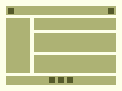
CSS Battle #235 – Website
 🎯 Play Challenge
📺 Watch Solution Video
🔢 Stats
- Match: ✅ 100%
- Score: 🟢 624.04
- Characters: 295
💡 Code
<p><a><b>
<style>
*{
  background:#FDFFE9;
  +*{
    background:#ADB274;
    margin:20;
    *{
      position:fixed
    }
  }
}
p{
  padding:5+200;
  margin:30 0;
  color:FDFFE9;
  box-shadow:0 201q,95q 53q,95q 127q
}
a{
  padding:95+5;
  margin:0-120
}
b{
  padding:10;
  background:#555A2A;
  margin:105 85;
  color:555A2A;
  box-shadow:32q 0,-32q 0,-175q -244q,175q -244q
}
</style>
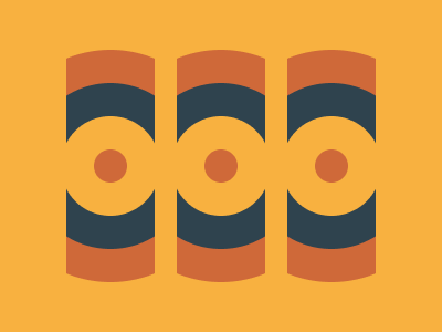
CSS Battle #236 – Concentrate
 🎯 Play Challenge
📺 Watch Solution Video
🔢 Stats
- Match: ✅ 100%
- Score: 🟢 615.36
- Characters: 342
💡 Code
<p><a><b><c>
<style>
*{
  background:#F8B140;
  *:not(c){
    border:32q solid;
    border-radius:50%;
    margin:45 95;
    color:CF6939;
    box-shadow:106q 0,-106q 0;
    *{
      position:fixed
    }
  }
}
p{
  padding:45;
  margin:0;
  color:2F434E
}
a,c{
  padding:15;
  margin:-45;
  color:F8B140
}
b{
  border:16q solid;
  margin:-15
}
c{
  padding:100+10;
  margin:-100 40;
  box-shadow:148q 0 0 42q;
  -webkit-box-reflect:left 80px
}
</style>
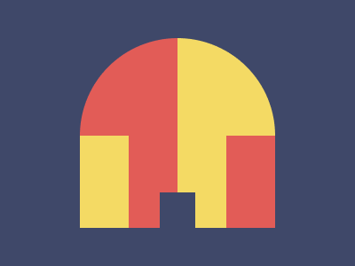
CSS Battle #237 - Round castle
 🎯 Play Challenge
📺 Watch Solution Video
🔢 Stats
- Match: ✅ 100%
- Score: 🟢 640.23
- Characters: 241
✅ Code
<p>
<style>
*{
  background:#3F4869;
  +*{
    background:linear-gradient(to left,#F4DA64 50%,#E25C57 0);
    margin:43 90;
    border-radius:2in 2in 0 0
  }
}
  p{
    position:fixed;
    padding:44+19.5;
    margin:174 90.5;
    box-shadow:-83px -56px 0 8px#F4DA64,83px -56px 0 8px#E25C57
  }
</style>
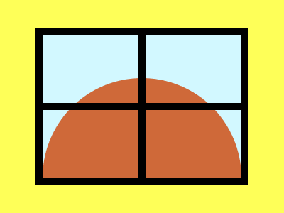
CSS Battle #238 - Rising sun
 🎯 Play Challenge
📺 Watch Solution Video
🔢 Stats
- Match: ✅ 100%
- Score: 🟢 634.54
- Characters: 257
✅ Code
<p><a><b>
<style>
*{
  background:#FEFF58;
  +*{
    background:#D2F8FF;
    margin:40 50;
    border:11q solid;
    *{
      position:fixed
    }
  }
}
  P{
    padding:70+140;
    background:#CF6939;
    margin:60 0;
    border-radius:2in 2in 0 0
  }
  a,b{
    background:#000;
    padding:100+5;
    margin:-130-5
  }
  b{
    padding:5+140;
    margin:-5-140
  }
</style>
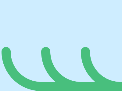
CSS Battle #239 - Waves
🎯 Play Challenge
📺 Watch Solution Video
🔢 Stats
- Match: ✅ 100%
- Score: 🟢 632.93
- Characters: 262
✅ Code
<p><a><b><c>
<style>
*{
  background:#CEEDFF;
  position:fixed;
  color:48BF7D
}
  p,a,b{
    padding:50+120;
    margin:162-3;
    border-style:solid;
    border-width:0 0 30 30;
    border-radius:0 0 0 2in
  }
  a,b{
    margin:-50-20
  }
  c{
    border:16q solid;
    margin:-65-410;
    border-radius:50%;
    box-shadow:138q 0,275q 0
  }
</style>
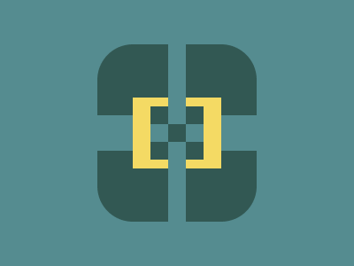
CSS Battle #240 - Snapshot
 🎯 Play Challenge
📺 Watch Solution Video
🔢 Stats
- Match: ✅ 100%
- Score: 🟢 622.92
- Characters: 300
✅ Code
<p><a>
<style>
*{
  background:#558C90;
  +*{
    background:#325853;
    margin:50 110;
    border-radius:42q;
    *{
      position:fixed;
      -webkit-box-reflect:left 22q
    }
  }
}
  p{
    padding:10;
    margin:90 100;
    color:325853;
    box-shadow:0 21q,0-21q,11q -21q 0 11q#F4DA64,11q 21q 0 11q#F4DA64,53q 0 0 11q#558C90
  }
  a{
    padding:10+60;
    margin:60-80;
    rotate:90deg
  }
</style>
CSS Battle #241 - Mint Typewriter

🎯 Play Challenge
📺 Watch Solution Video
🔢 Stats
- Match: ✅ 100%
- Score: 🟢 626.96
- Characters: 283
✅ Code
<p><a><b>
<style>
*{
  background:#3D3824;
  position:fixed;
  border-radius:11q
}
  p{
    background:#F7FFCF;
    padding:55+140;
    margin:117 52
  }
  a{
    margin:-95-120;
    padding:55+120;
    background:linear-gradient(#F7FFCF 36%,#86C78D 0)
  }
  b{
    padding:20+100;
    margin:-75-100;
    background:linear-gradient(#86C78D 50%,#3D3824 0)
  }
</style>
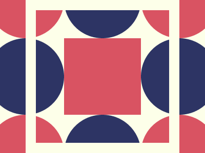
CSS Battle #242 - Orbital Tiles
🎯 Play Challenge
📺 Watch Solution Video
🔢 Stats
- Match: ✅ 99.9%
- Score: 🟢 597.67
- Characters: 266
✅ Code
<p>
<style>
*{
  background:#FDFFE9;
  +*{
    margin:75 125;
    border-radius:50%;
    color:2D3464;
    box-shadow:-159q 0,0 159q,159q 0,0-159q,-159q -159q#D95362,-159q 159q#D95362,159q 159q#D95362,159q -159q#D95362;
    *{
      padding:75;
      background:#D95362;
      outline:22q solid#FDFFE9;
      outline-offset:59q
    }
  }
}
</style>
🙌 Support & Subscribe
If you found this post helpful:
- 🔔 Subscribe on YouTube for more CSS Battle content
- 💬 Share your feedback or questions in the comments
- 💡 Try tweaking my solutions and let me know your improvements!
You can also connect with me on LinkedIn, GitHub, or Twitter.